Logos
Introduction
This logo is our calling card and should anchor all university communication. It is a symbol that will ensure brand recognition over time when used consistently. All university logos and lockups are created and managed by Strategic Marketing and Communications.
University logo
University logo
The university logo should be used at every opportunity on print and digital media, unless size and space won’t allow. It must be present on external, off-campus collateral.
Circle mark

Circle mark
The circle mark can be used in lieu of the formal university logo for internal audiences such as for on-campus marketing. The best practice is to always use the circle mark in conjunction with the typeset university name in communication.
Logo color variation
Logos must be used in the approved color variations.
Full-color
The full-color logo is the preferred version. Use it on white or light-color backgrounds. Frequent use of the full-color logo will reinforce the color association with the university.
Inverted
The inverted logo maintains the red circle mark while allowing for use on dark backgrounds. When using, ensure sufficient contrast between the red circle mark and the background to avoid eye strain.
White
The all-white inverted logo is used for a mid- to dark-color background or photograph. Ensure the background is dark enough for the logo to stand out.
Black
The black logo can be used when color printing is not available, a one-color imprint area is needed or when the composition is enhanced by it.
Brand hierarchy
A clearly defined brand hierarchy helps ensure a cohesive and impactful brand experience by establishing the relationship between the university and its various entities.
At the core of the identity system is the primary university brand, which serves as the central reference point for all branding efforts. All academic colleges, schools, and departments are considered extensions of this primary brand, and their identities are built to align with and support it.
Consistent application of the primary brand across communications and marketing materials is highly encouraged. This approach enhances overall brand recognition, strengthens the university’s reputation and delivers a unified message to both internal and external audiences.
Lockup guidelines
Lockups combine elements of the primary brand with the name of the entity. The purpose of a lockup is to protect the core elements of the brand, reinforcing the connection between the primary brand and its entities.
To protect the primary brand and its reputation, the following guidelines must be adhered to:
- All lockups must be created by Strategic Marketing and Communications.
- All primary lockups must be representative of the current University of Illinois Chicago organizational chart.
- Acronyms cannot be used.
- Lockups will be provided in four color variations: primary color, inverted, white, black. Lockups cannot be altered from these colors.
- All lockup requests are reviewed by Strategic Marketing and Communications and are subject to their approval process.
- Informal lockups created for merchandise-only reasons must not be used for other communications purposes.
Primary brand
The university logo should be used at every opportunity on print and digital media and must be present on pieces that reach an external, off-campus audience.
Primary sub-brands
Formal lock-ups

All academic colleges and schools are primary sub-brands. These entities combine the primary brand with the name of the college or school. This lockup is used for formal communications or outward facing communications when it is paramount to identify the college or school.
Informal lock-ups
All primary sub-brand also receive an informal lockup, combining the UIC circle mark and the shorthand college name. This is ideal for internal audiences and on-campus marketing.
Secondary sub-brands

Secondary sub-brands are offices, services, units and initiatives. Informal lockups can be created for these entities, combining the informal lockup with the name of the department, center, institute or program. Because it does not contain the full university name, it is preferred for internal audiences only.

UI Health brand and identity
UI Health is UIC’s academic health enterprise. UI Health has their own identity standards to maintain the integrity of their brand. Please visit the VCHA brand and identity page for further guidance.
Logo clear space
An area the height of the “UIC” in the circle mark should be maintained around the logo to separate it from text, other design elements, or the edge of a page, screen or bounding box.
Incorrect usage
Do not alter logos from their original form. Below are some examples of incorrect treatments.
Color

Do not deviate from the brand logo combination of colors or add an outline.
Proportions

Do not stretch, condense or change the proportions of the logo.
Contrast

Do not allow for low-contrast between the logo and the background.
Cobranding and partnerships
For instances where the university is partnering with another organization, it may be appropriate to display a cobranded lockup. Please use the examples below as guidance. Logo order will depend on who is the primary or hosting brand.
Option 1
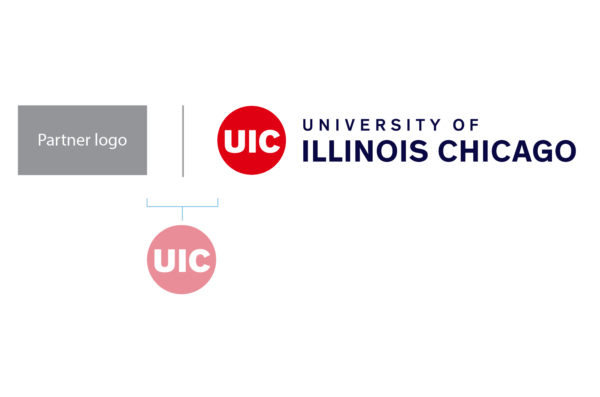
Option 1
Option 2 partner logo
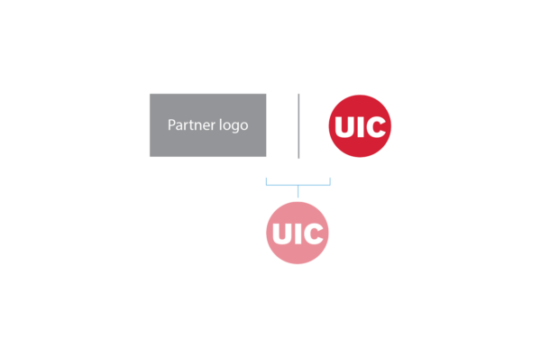
Option 2
Multiunit sponsorship
For branding that involves multiple university units, use the university circle mark as a primary indicator and group all supporting units as text.
Option 1

Option 1
Option 2